Ok, first I'm going to quality this by saying I have 7 years of art training and I am doing a diploma in interior design and my last class was called "Color". That being said - the yellow and salmon colors on that sample are horrendous.

I can explain why - there's a reason it's so bleh to look at and it has to do with the color wheel and intensity of colors...
For it to look good, I suggest sticking with the blue and green and adding ONE other color as maybe an accent, but using shades of the blue and green for almost everything.
Also, the shades of blue and green would work out better together if the green was more toward blue (as opposed to yellow) and the blue was more toward green (as opposed to red).
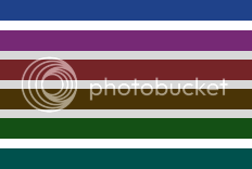
Ok, easier to show than explain...
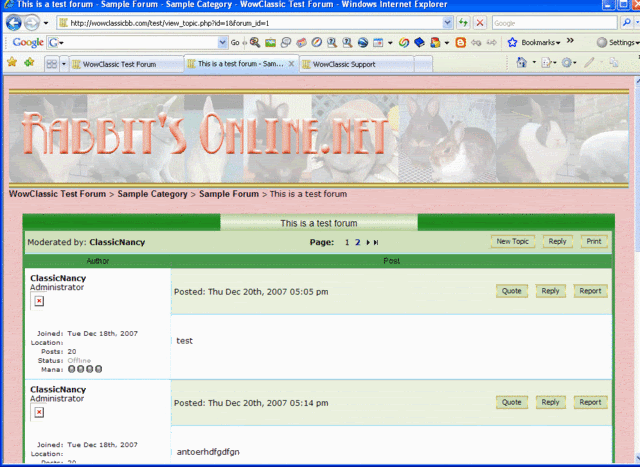
So what I did was stick to the aqua/green theme where the green is leaning more toward blue so the colors don't clash. Then an accent color... that also doesn't clash, so something that has blue in it... purples .. or reds that are more toward burgundy/purple than orange. Orange or anything with yellow in it that's really intense (ie salmon and that sunshine yellow) willvibrate off the pageand be puky with the blues and greens unless you start making your greens have more yellow in it or tone the color way down so that it's a neutral.
Also, it's an intensity thing right - you have to mix up the darks with the light or everyone will get a headache.

Anyway now I'm babbling, don't know if any of that made sense... just my 50cents.

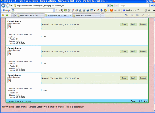
Edit: I forgot to add that I really like the layout with the sidebar by the way - will be nice to have the stats and things easily viewable.

Nad
