SITE DESIGN FEEDBACK (new)

Rabbits Online Forum

Help Support Rabbits Online Forum:

This site may earn a commission from merchant affiliate links, including eBay, Amazon, and others.
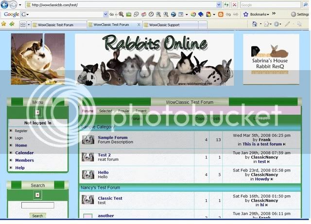
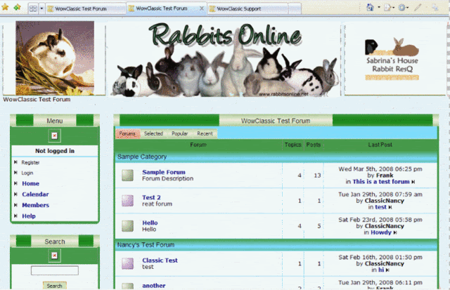
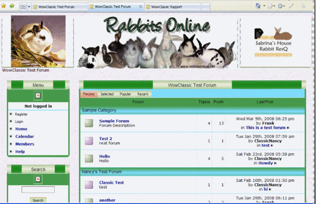
how about solid blue and a touch of pink?

PS: I made the banners smaller just to see how bad it would be if a lot of blue was showing. (Personally, I think if it was just a tad lighter, I'd like this one, but I'm still fiddling). :)

bluesolidpinkdarry.jpg


Nope, too busy I think.

The separation is good to a point, but then I think it makes it look like a photo album.

I really like that first and last on those ones you did above.
 
Nope, still like the last version with the light blue background. (Is it textured?) No pink! No Salmon! No Orange! (Too distracting, and bunny noses really aren't pink anyway!)

Tone down the turquoise blue to teal or something closer to the greens. I liked it with less seperation between the banners.
 
Yeah, the darker blue is too much.

Don't get insulted when everybody's advice isn't followed, btw... Case in point, we'll have little control over separation between banners because they'll always be rotating, some are bigger, some are littler and some are different shapes.

I only did it this way to test the 'overwhelming' factor on a darker colour.It's also possible we won't even have the two upper cornerbanners, soyou can't really judge face value.

(And there WILL be a touch of pink -- just like the current forum). ;)There has to be something a little unique, back to the 'brand recognition' thing.

I call the first one the bathroom background... but I kinda like it. :) Or maybe a lighter blue, we'll have to see how that goes.

I actually liked the little cartoon bunny we have now (a touch of pink, too) ;) rather than a bunny pic in the button, but maybe somebody will come up with a third option.

Keep in mind I"m just working with Paint.net (which I've never used before), a screen captured image,and a really obstinate mouse and keyboard, I really can't do much in terms ofa 'final product'.

I don'treally like the extralight green in the center of the border, btw.Going to try puttingsomethingelse in there. That may bewhy it's appearing to be too busy.

(PS:When I first 'fiddled' with the current forum, nobody really liked it much,either). ;)
 
Not insulted Pipp! Not at all! LOL! You asked for opinions... (didn't some one once say be careful what you ask for... you might get it?) Nuthin' personal... you have to go with what works best. (I just hate pink as much as you hate purple! ROFLMAO!)
 
I LOVE pink - I just don't think it works for Rabbitsonline.

I really love that bottom of those three tho. I think it has a really nice, calm, and friendly look.

So, if we can get somewhere around that..... I'd like it. I also think that with a mild pattern like it has - it's easy on the eyes even when the space between items is a bit bigger.
 
Pipp wrote:
how about solid blue and a touch of pink?

PS: I made the banners smaller just to see how bad it would be if a lot of blue was showing. (Personally, I think if it was just a tad lighter, I'd like this one, but I'm still fiddling). :)

bluesolidpinkdarry.jpg

I think this one is pretty good, but I'd go lighter on the blue background and lighter on the green headings so you don't have dark font against a dark background.

The pink is hideous, I think you should add the pink/salmon signature color on the donation button like it is now.

Pam
 
Just for you guys,I'll be making it just a TINY touch of pink). ;)

(And Pam, I'd LOVE to replace that orange,now THAT is hideous!!)

Don't worry about me getting insulted, I definitely want opinions, just can't follow all of them. (And I am big on something unique, even if it's a wee bitobnoxious -- but just a WEE bit).

Biggest problem I've got right nowis that I have no idea how the colour changer works! And I really don't want to be colouring this stuff by hand. OnceIfigure it out, I won't be inclined to say, 'screw it, good enough to see what a shorter banner and darker colour would look like'. Ergothe darker blue and yes, that pink.

And I'm sure the real designers will step in with the real thing, or I'll actually get access to the software and fiddle with the real thing.

I'mstill trying toget the Royal border mocked up to see whatTHAT will look like, although totally beyond my skills. Ditto with seeing if a transparentphoto background will work).

We may be able to run a white strip right across the top, btw, so that will lessen the overtness of the background and/or images.

(And guys, just remember the firstpink, purple and greendesign, that shouldmake these ones look better!) :biggrin2:


I like orange....... On Tony Stewarts Car.

Otherwise.... ewwwwwwwwwwwwwwwwwwwwwwww

Yes, Pipp..... definitely better than easter egg on crack colors! ;)
 
Pipp wrote:
I like the back ground on these very much, but now, and i know you want to do this :boxingto me , but with the lighter back ground "I" think the green is too dark. I like the green if the rest of the colors where more complimentry to it. just my :twocents
 
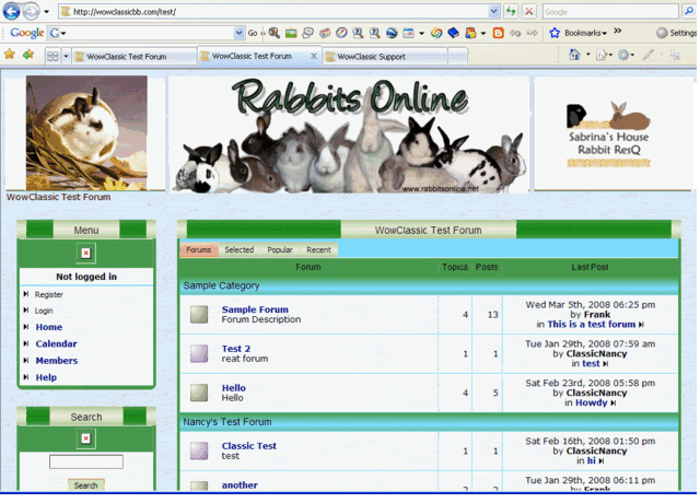
Now this is REALLY rough... had to cut n' paste from another forum, string a couple together to make it long enough, etc, but I must say I love the Royal banner on here. :)

And yes, the bg blue is still too dark and/or too blue, but that will have to wait.

(And Luv, I agree re: the green!)

bluesolidpinkroyal3.jpg

 
Ditto.


Haley, I covered the green with the awesomely cool (IMO) 'Royal' borderdesign and that caused the green to be less overt, as I knew it would. Won't know the full effect until I see the whole page.

And it turns out the same type of glitch that keeps eating the Library posts (related somehow to posting member profile links in proximity to url links) ate half the date in my PMs to the designer, Nancy. She didn't receive any of my links with sample graphics including Nadia's colour pallet, Stephie's banner, or the Royal border suggestion. And half the text was gone. (Of course she didn't know there was anything missing).

I have now sent her the above sample and asked her to carry on in that mode. The only changes I asked for was a textured blue background, and to lose the marbling in theboxes and forums/posts area.

I still think we have a communication gap, however.

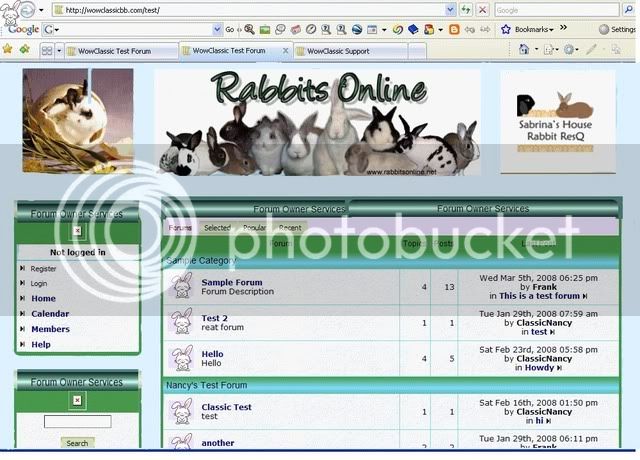
The end result was...

this....


nancybathroom.gif


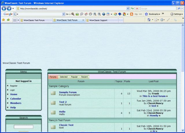
Here's a lower view...

nancybathroomlower.gif


(That greenwas the colour I called the bathroom style, remember). ;)
Now, it's pretty. Just not what we want. :sigh:

I had especiallyliked the blue/green fade in her category or forum separators. (And notice she put a strongerpink back. ;) Wasn't me!!)

We can use this design (or one like it) for a second theme for people who like a darker background.

This isn't all... Not sure if this is actually what she's planning, I'm sneaking peeks before she tells me too look, but this is what's on the inside...

nancybathroominside.gif


On the good news side, StephieMarie has been fiddling with the Portal page ... which is going to be an intro homepage to the forum heavily promoting the Library and housing ads for rescues and contests and the like.

Check it out!

http://server.holeinthewallhosting.com/~sas/

(This is a very rough idea, no need tocomment on specifics).;)

s


Latest posts

Back
Top