Luvmyzoocrew
Well-Known Member
i like 4, 8, 15
i love the coloring one with Barney, his color goes great with the green and blue in it.
i love the coloring one with Barney, his color goes great with the green and blue in it.

I have a stupid question. Is there any way that the person who designed this one could remove the "Rabbits Online" - darken up the pictures and then put the website address on here somehow so it shows up - yet still shows the bunnies?Logo 4:
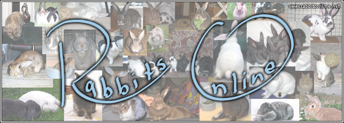
I guess I'd love to see a slightly edited version of this logo for us to look at...

I'd love this if the lettering wasn't in the way of the bunnies....it is such a change from our current logo (which I do like) but it features so many bunnies.TinysMom wrote:I guess I'd love to see a slightly edited version of this logo for us to look at...
I darken it but don't know how to remove the lettering.


The only problem Jan hesitated with Number 15 ............ Is that she is afraid of butterflies.one which shows off the most bunnies in the best way ...... Number 15
 rivateeyes
You know, you said that, and an awesome Summer banner came to mind with Beach Bunnies and a crab...pail and shovel...hmmmmBut Jan, I could understand how you'd feel about the butterfly! I'm not sure I'd be too happy if there was a picture of a crab up there lol
:shock:mouse_chalk wrote:You know, you said that, and an awesome Summer banner came to mind with Beach Bunnies and a crab...pail and shovel...hmmmmBut Jan, I could understand how you'd feel about the butterfly! I'm not sure I'd be too happy if there was a picture of a crab up there lol
LOL
Da Plane .... Da Plane, I see da Plane (Banner). :biggrin2:OK, I'm going to post #15 for now.
Let me know. It will have to be tomorrow though...whenI can get on my computer again.Looks AWESOME!!
:great:
(May have to be a bit smaller tho).