BUSINESS CARD FEEDBACK & DISCUSSION

Rabbits Online Forum

Help Support Rabbits Online Forum:

This site may earn a commission from merchant affiliate links, including eBay, Amazon, and others.

TinysMom

Well-Known Member
Joined
Apr 4, 2005
Messages
15,929
Reaction score
42
Location
, Texas, USA
The business cards got sent out on Monday of this week to all those who PM'd me their addys. My one concern is I didn't get a chance to weigh the envelopes - I wound up mailing them first because I didn't have time to stop at a post office...so they might come with a few cents postage due - I hope not. If so - I apologize!

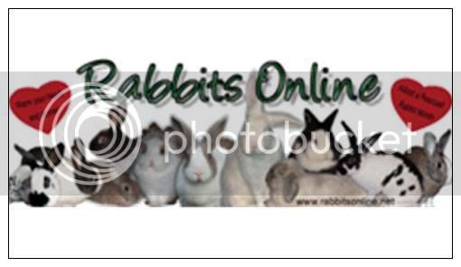
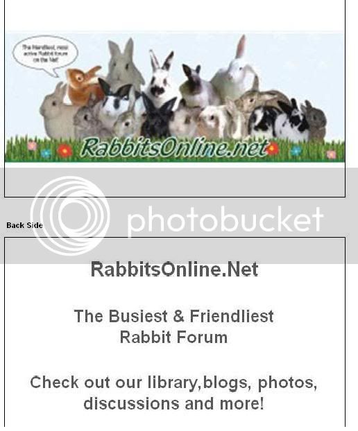
Now - we already know that there is one error on the back of the card - there should be a space between the comma after library and blogs. In other words, I should have made it look like this: "Check out our library, blogs, photos, discussions and more!"

There is a good chance that when we decide on business cards - they won't say anything on the back.

I've asked that the other Sr. Mods and Admins share the other designs we saw - it may take a couple of days to dig them up and get them out here.

Some questions I'd like to hear input on are:

  • Do you like the look of the banner on the cards?
  • Would you prefer to see only one bunny on the card? (You'll be seeing pictures of this)
  • If we used one bunny - should it be a bunny from the forum or should it be a "stock image" we use from a company?
Some other questions are:
  • Did you like the quality of the business card itself? (The cardstock we used)
  • Do you feel the cards should be glossy or matte? (Glossy costs more)
  • What should the cards say - if anything - beyond our website addy?
I know it would be nice for us to have several different designs for business cards and then folks could choose what they want - but something to consider is that for every design we have - we will have a setup fee (if we design them ourselves) - it isn't much - but it is something - and we get price breaks for larger orders of business cards.

For example - let's say we were going to order a total of 5,000 business cards for our first order.

If we order 5,000 of one design - it is $79.99 plus shipping. 2,500 of one design is $54.99 - so we'd pay about $110 in order to have two designs. If we wanted five designs, we'd be paying $39.24 per thousand or about $200 plus shipping. So you can see that it is much cheaper for us to have one or two designs versus several designs. (This is just with VistaPrint - I don't know about other companies).

We look forward to hearing your input once you start receiving the cards in the mail.

If there is anyone who hasn't pm'd me yet with their addy - please send it to me and I'll get the business cards off to you this weekend (I want to see first if I used enough postage).


I havent gotten my card yet so i am making a suggestion without seeing it, so take it for what it is worth,lol. But i was thi nking that if you decide to use one bun instead of what is on thier now and you dont want to use a company design you could hold a contest for the bunny for the card. Everyone submit one pic and then everyone votes on it type of thing. Just a suggestion if you go that route.


I am excited to get my card cant wait.
 
I got the cards Peg! (No postage due! LOL!)I really like the banner, (but I wish it could be bigger). I like the idea of using an "assortment" of bunnies, we cover the entire spectrum of rabbit ownership...big ones, little ones, mixed breeds, "Up Ear", "Down Ear", etc.... LOL!

The Lettering "RabbitsOnline.net" should be seperate, maybe on the white background. It's noteasily readable with the green-on-green.

It's very representative of the Forum.


To answer your questions, the card stock is nice, it doesn't have to be shiney....
 
I was just playing around on vistaprint and using our "adoption" banner we had earlier this year to see how it would look on a card. Here it is.....

adoptionbannercardpreview.jpg


I really like the banner idea (because it ties into the forum) but I think we have too many bunnies to really be able to see them. I think you can see what I mean when you look at the difference between the adoption card above....and this picture of the card that folks are receiving...

ROCardIdesignedsorta.jpg


Here is a card Haley did on 123.com using a stock image. This is a good example of a card with one bunny on it.

As far as taking photos and having folks vote - one of our issues is that we want a "professional" looking photo...at least that is the input I've heard so far....versus a "cutesy" photo.

RO123printcard.jpg


More input is welcome....and feel free to think "outside the box" and make suggestions too!


Got my cards today too, Peg! Thank you!

Have to admit, I squealed that Nemo was on the card, teehee :)

But I do like that professional looking one posted a couple of posts above (and that is a cute professional looking bunner too!).

I agree with moving the URL on the front of the card to the white part and maybe making it in a black font as well.

Other than that, I like the back. Says exactly what it needs to say.

I think this was a great idea, but I do like that professional looking one a few posts above the best.

Tracy
 
Got my cards today too, Peg! Thanks so much! I love them!:D

Only thing I would like to suggest to add on the back: Medical discussions (but not dismissing seeing a vet) and nutrition/behavior discussions.Maybe that would entice more people to join knowing they can get this great advice for free and not necessarily needing to see a vet. (There are so many questions asked that don't require a vet visit.)

Maybe like: Check out our library, medical & nutrition/behavior discussions, photos, blogs and more!

Just throwing it out there.:)

Oh, and I can't read the caption in the pic on the front, needs to be bigger, if that's possible.:)

 
I LOVE the cards. Morgan was a little sad that his cute face wasn't on there, though :p.

The was a typo and with my slight OCD-ness, it gets me :craziness...lol...

It looks like this on the card....

"Check out our library,blogs, photo's..."
^ no space.


I like the design, though, really like it! I think it would look great glossy. I also think a mention of health care, toys, foods....would be good to include. Many people don't know bunnies need toys and a lot of people look to forums for health care.
 
I got mine today!

I like them, I think the info on the back is perfect (well, except the mistake) but the one thing about them is that I didn't like how the banner sat on the card. I think if we have a business card we shouldn't necessarily just have that banner. Because the banner doesn't fit properly it looks a little bit 'dumped' there. I could always create a business card front in a similar design to the banner as I have kept the original files. I think a business card shaped design of the banner would 'tie' in the site and the card. I think the info should be on the back though.

Another thing, I think a glossy would look more professional. They didn't look very professional. The printing wasn't crystal clear and the card they used looked a little cheap. I know making it look more expensive would obviously cost more, but I think it would make it look a whole lot better! I think you need to see what the printing company's costs are and see if its worth it. I'm sure everyone would be willing to buy the cards anyway so there wasn't a huge loss.

Fran :) :hearts :brownbunny
 
Some comments I want to add...

When I did the cards - I played around with the banner trying to stretch it out - make it taller - etc. Whenever I did that - the bunnies looked really weird. It didn't keep the integrity of their shape (I'm probably not saying that right).

Adding glossy finish to 1,000 cards would be $11.24 - for 250 cards it was like $7.99. To go to heavier paper it is $14.24 for 1,000 cards.

That is just on vistaprint - I don't know about the others as I've never used them before.

I want to remind folks that RO isn't exactly a "money-making" venture that can afford a lot ~ in fact ~ we frequently are struggling (like everyone else) with the bills. Or at least that is my impression. I took that into consideration when I did the test cards - just to see if they would be adequate....

If I remember right - for artwork - we were going to use the bunnies in order of the sponsors...meaning we'd use Platinum sponsors first...then gold...then VIPs.

I think if we're going to go with a banner design - we ought to stick with mainly one rabbit from each platinum member - which would be 8 bunnies. They might fit better on the card than the 17 that are on there now.

Or if we are going to pick to choose one bunny on a card - maybe only have a contest from those 8 entering a picture? I don't know. The thing is - we'd need to get a professional looking type photo (I guess) - not just a "oh what a cute picture" type photo.

Here is a list of the Platinum members to date...

VIP Platinum

BlueGiants
Elf Mommy
Jenson
Leaf
Mouse_Chalk
Slavetoabunny
Timetowaste
TinysMom

I want to state for the record....I would prefer to not use Tiny's picture (I have had a couple of people suggest it privately since I'm a platinum member). While he may be with us in spirit and he was much loved here.....he is not with us now and I think it would be better to get a current forum bunny on the cards. Just my .02. (I am not against using him in a banner if you need a black rabbit to complete the look).

I'm hoping more folks will chime in with ideas, etc. - and thanks to those who mentioned the error (which I did point out in the very first post). Glad to see y'all caught it - wish I had caught it when I was in a hurry to get them printed so we 'd have SOMETHING to get a discussion going with..


I think my Mum has a Photos.com account if you need a stock photo, Ii'm guessing you already have a suitable image site though...

What about using some of our members photos that look really professional? I can't think who has them now, but someone on here always has fantastic photos with lovely white background etc.

Fran :) :hearts :brownbunny
 
I got mine and I do like them, I agree that the rabbitsonline.net should be above the image however I do like the image. Maybe we can remake it lower the image so it sits at the bottom of the card. white back ground, and RabbitsOnline.Net above it.

I might play around and make a few cards today.
 
I got mine (thanks Peg :))

I like the card stock. I agree that the Rabbits Online would be better on either the top or bottom, on the white background.

I think multiple bunnies is a good idea, and preferably 'our' bunnies - i like the idea of the 8 Platinum rabbits. However, on the proffessional one you showed, I love that it says "We're here to help". Perhaps that could be added to it somewhere, so new people know they can get advice/help as well as meet other Rabbit People.

Jan
 
Back
Top